Most design reviews fail for the same reason: nobody said what the review was supposed to decide. So people comment on whatever catches their eye, the designer collects forty contradictory notes, and the file goes back for another round that settles nothing.
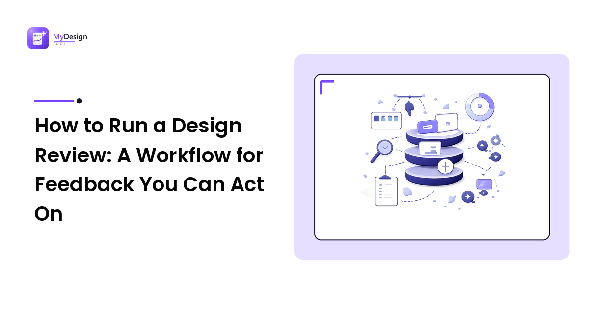
A design review that works is a workflow, not a meeting. Name the decision the review must produce, show only the artifact that answers it, ask a specific question, then triage the responses by layer and write down what was decided. Everything below is that sequence in detail — and the mistakes that quietly break it.
What a design review is actually for
A review is a decision-making event, not a performance. It exists to answer a question you cannot answer alone: does this structure hold, is this on brand, does this flow make sense to someone who has not been staring at it for two days.
That framing matters because it tells you when a review is finished. A review ends when the question is answered and the next step is written down — not when everyone has run out of opinions. Reviews that have no question have no ending, which is why they sprawl.
It also tells you who belongs in the room. Invite the people whose input changes the outcome: whoever can approve, whoever will build it, and one or two people close enough to the user to spot a real problem. An audience of spectators generates noise, and noise is what you are trying to prevent.
Step 1 — Write down the decision the review must produce
Before you schedule anything, finish this sentence: "By the end of this review, we will have decided ______." Approve the layout for the pricing page. Choose between two navigation patterns. Confirm the checkout flow is clear enough to build.
If you cannot finish that sentence, you do not need a review — you need more time on the work, or a quick one-to-one to unstick a specific problem. Write the decision at the top of the file or the message. It becomes the filter for every comment that follows.
Step 2 — Match the artifact to the question
The single biggest source of bad feedback is showing the wrong thing. A polished visual invites visual comments even when you needed structural ones; a gray box invites structural comments even when you needed sign-off on the look.
- Deciding structure, hierarchy, or flow? Show a wireframe. Low fidelity keeps attention on arrangement.
- Deciding how it looks? Show a high-fidelity mockup with real content, not placeholder text.
- Deciding whether it works? Show a clickable prototype. Nobody can evaluate an experience they cannot use.
If the distinction between those three is fuzzy for you or your reviewers, it is worth settling the difference between wireframes, mockups, and prototypes before the review rather than during it.
Show one direction unless you are explicitly asking for a choice between two. Presenting five options is not generosity; it is handing the decision to the room and hoping they agree.
Step 3 — Pick the format: async or live
Both work. They are good at different things, and the mistake is defaulting to one out of habit.
| Async review | Live review | |
|---|---|---|
| Best for | Detailed critique, visual polish, distributed teams | Trade-offs, disagreement, exploring alternatives |
| Feedback quality | Considered, written, easy to track | Fast, but shaped by whoever speaks first |
| Risk | Silence, or comments that never resolve | Groupthink and unrecorded decisions |
| Time cost | Reviewers choose when | Everyone at once |
| Needs | A clear written brief and a deadline | An agenda and someone to run it |
A practical default: run detail-level critique async, and reserve live time for the moments where people disagree or where a trade-off needs to be talked through. Many teams combine them — comments land async first, then a short call resolves only the conflicts.
Whichever you pick, set a deadline. Async reviews without one do not end; they decay.
Step 4 — Frame the ask before anyone looks
Post a short brief above the work — three or four lines is enough:
- The decision you need (from step 1).
- Context: who this is for, what constraints exist, what is already locked.
- What you want feedback on — and what is out of scope. "Structure and content order, please. Colours are not final."
- The deadline, and how to leave comments.
That fourth line about scope does most of the work. Reviewers are not being difficult when they comment on the wrong layer; they simply do not know which layer is open. Tell them.
Step 5 — Keep feedback in one place, pinned to the work
Comments scattered across chat threads, email, and screenshots are how feedback gets lost and re-litigated. Collect it where the design lives, attached to the specific element it refers to. If a stakeholder insists on sending notes another way, transcribe them into the same place yourself — one thread, one source of truth.
Also ask for the problem, not the fix. "Make the button bigger" is a solution someone invented on your behalf. "I did not notice the button" is the observation underneath it, and it may have a better answer than size. When you receive a prescription, ask what they were experiencing when they wrote it.
Step 6 — Triage the comments by layer
Do not respond to feedback in the order it arrived. Sort it first:
- Blocking — breaks the decision you needed to make, or breaks a requirement. Resolve before moving on.
- In scope — legitimate notes on the layer you asked about. Act on them.
- Out of scope — real but about a layer that is not open yet. Log it for the right round; do not silently ignore it.
- Preference — a personal taste call with no reasoning attached. Ask for the reason. If there is none, it is a tie-break for whoever owns the decision.
- Contradictions — two reviewers want opposite things. This is not a vote. Take it back to the goal in step 1 and let the person who owns the decision choose.
Triage is where most of the value of a review is created, and it is the step people skip.
Step 7 — Close the loop
End every round with a short written summary: what was decided, what changed, what was deferred and to when, and who does the next thing. Send it to everyone who commented.
Then version the file, so "the latest one" is never ambiguous. Closing the loop is what stops the same comment appearing in the next review — reviewers who see their note acknowledged stop repeating it, and reviewers who never hear back keep escalating.
Common mistakes that derail a design review
- No stated decision. The review becomes a reaction session and ends without resolving anything.
- Showing high fidelity too early. Polished visuals pull every comment toward styling, even when the layout is the open question.
- Inviting everyone. More reviewers means more opinions and less clarity about who decides.
- Presenting instead of asking. A long walkthrough of your reasoning trains people to be polite, not useful. Give context briefly, then hand over the question.
- Treating feedback as a vote. Consensus averages designs into mush. Someone owns the decision; the review informs them.
- Defending the work in real time. Ask clarifying questions during the review; make the judgement calls afterwards, when you are not under pressure.
- No deadline on async reviews. They stall indefinitely and then get skipped entirely.
- Never writing down the outcome. Undocumented decisions get reopened, usually by the person who missed the meeting.
FAQ
How long should a design review take?
Shorter than most people schedule. A focused review of one flow or screen set is usually a 20–30 minute conversation once reviewers have already looked at the work. If a review regularly runs long, it is a sign that too many decisions were bundled into one session — split them.
Who should be in a design review?
Whoever changes the outcome: the person who can approve, the person who will build it, and one or two people close to the user. Everyone else can be informed by the written summary. A large audience makes reviews slower and the ownership of the decision less clear.
What is the difference between a design review and a design critique?
A review is oriented toward a decision — approve, choose, or proceed. A critique is oriented toward improving the work, often with no approval attached. Both need a stated focus, but a critique can stay exploratory while a review has to end in an outcome you can act on.
How do I handle contradictory feedback?
Go back to the goal you wrote in step 1 and ask which option serves it better. If both are defensible, the person who owns the decision picks, and you record the reasoning. Averaging the two is almost always worse than choosing one.
Should design reviews be async or live?
Use async for detailed, considered critique and for teams spread across time zones; use live time for disagreements and trade-offs that need discussion. Running detail async and reserving a short call for conflicts gets most of the benefit of both.
Next step
Before your next review, do just one thing differently: write down the single decision the review has to produce, and show only the artifact that answers it. Add the scope line — what is open, what is locked — and finish with a written summary of what was decided. That alone converts most rounds of vague reactions into feedback you can act on. For more practical, tool-agnostic design workflow guides, visit MyDesign Tool at https://mydesign-tool.com.