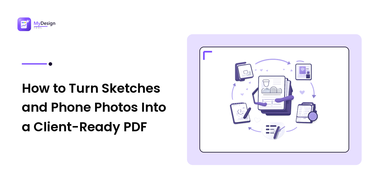
Every project generates work that never makes it into your design tool. A page of thumbnail sketches. The whiteboard from the kickoff call. A printed proof with the client's pen marks on it. A signage mock-up photographed on site. These are frequently the most persuasive things you produce all week, and they usually die in a camera roll — because sending them means either fourteen attachments or a shared album nobody opens.
The takeaway up front: the reason photographed work looks amateurish is almost never the phone camera. It is that the images arrive as loose files in arbitrary order, at wildly different exposures and sizes, with a thumb in one corner. Fix the capture, fix the order, then combine them into a single PDF, and exactly the same photos read as a considered document. The job is four decisions — light, crop, order, weight — and once you have done it twice it takes about five minutes.
Why one PDF beats a folder of images
- Order travels inside the file. A zip of JPGs opens in whatever sequence the recipient's file browser feels like; a PDF opens on page one and moves forward, so you control how the argument is read.
- It is one attachment to name, version, and find in a thread three weeks later — it renders the same on a phone, a laptop preview pane, and a print driver, and it prints as a set, which loose images do not.
- It is annotatable. Most PDF viewers let a client comment or draw on a page, which turns a photo dump into something you can run a review against.
Step 1: light and angle, before anything else
Cleanup can rescue a mediocre photo. It cannot rescue a bad one, and the failure modes are always the same.
- Shoot near a window, not under a ceiling light. Overhead lighting puts your own shadow across the page and blows a hotspot in the middle. Indirect daylight from the side gives an evenly lit sheet.
- Get square-on. Parallel to the page, centred over it. A few degrees of skew is fixable; a steep angle bakes in perspective distortion that no amount of straightening undoes.
- Fill the frame, leave a small margin. Resolution you crop away is resolution you do not get back.
- One page per frame, flash off. Graphite and marker are semi-glossy, and direct flash produces specular hotspots that read as blown-out patches. Catching two sketches in one shot costs you the ability to order, crop, or drop them independently.
- Never photograph a screen. Take a screenshot instead — photographing a monitor produces moiré almost every time.
Step 2: clean up before you convert, not after
Do image work at the image stage. Once pages are sealed into a PDF, correcting one means going back to the original photo anyway.
Crop and straighten tight to the artwork, with the page edges parallel to the frame. This single step does more for perceived professionalism than anything else here.
Fix the tone. A raw phone photo of white paper reads mid-grey, because the camera exposes for an average. Raise the white point until the paper looks like paper, and pull the black point until pencil lines look like lines rather than smudges.
Consider grayscale for line work. A colour photo of a black-and-white sketch carries colour noise in the paper and a cast from whatever light you shot under. Grayscale removes both and shrinks the file as a bonus.
Leave colour alone when colour is the point. Photographing a printed proof or a fabric swatch documents colour, so do not push saturation to make it look nicer — and say in the document that a photograph is not a colour-accurate reference, for the same reasons print colour needs its own conversation.
Size sensibly. Pages read on screen rarely need a modern phone sensor's full output; as a rule of thumb, roughly 1,500–2,000 pixels on the long edge stays crisp at full-screen viewing without carrying weight you pay for later. Keep more if the pages will be printed at size. The same reasoning that governs exporting images for the web applies — decide dimensions on purpose.
Step 3: order is a design decision, not a file-system accident
This is the step people skip, and the one that decides whether the document feels authored.
Rename with a two-digit prefix before you convert anything. 01-brief-notes.jpg, 02-thumbnails.jpg, 03-refined-direction.jpg. Image-to-PDF tools commonly build pages either in the order files are added or in filename order, so setting the order in the filenames makes the result predictable — and repeatable next month.
Sequence the argument, not the timeline. Chronological order is how the work happened; it is rarely how it should be read. Lead with the direction you are recommending, then the alternatives you tested, then the notes explaining why. If you are running a structured review, order the pages to match the questions you will ask — the discipline that makes a design review produce feedback you can act on.
Add a plain first page with the project name, date, your name, and one line saying what the reader is looking at and what you want back. Two minutes in any design tool, exported as a single page, and it changes how everything after it is received.
Step 4: combine, then check what the reader sees
Assembly is a small job, and the kind of thing a free browser-based converter handles without an install: a toolset like EyePDF covers the two operations this workflow needs — turning a set of JPGs into a single PDF, and merging that PDF with pages you exported from your design tool. Free online PDF toolsets typically offer split and compress too, which matter next.
Whatever you use, check before sending: page order matches your filenames (look at the preview, do not assume); orientation is consistent unless a landscape spread genuinely needs to be landscape; the first page is your title page; nothing confidential crept in from the desk behind the sketch; and it opens cleanly on a phone, because that is where most clients will look first. If three pages turn out to belong to a different stakeholder, split them into their own file rather than sending everyone everything.
Step 5: weight — make it sendable without thinking about it
Photo pages are the heavy part; vector pages exported from a design tool are tiny by comparison. Fix weight at the image stage first, by resizing before the photos become pages — you keep direct control of the trade-off and can judge it at full zoom while you still have the original.
If the finished file is still awkward to send, compress the PDF. A compress step re-encodes the images inside the document, so open a detail-heavy page at 100% afterwards: if pencil lines have gone soft or handwritten notes are no longer legible, you compressed past usefulness and should go back and resize the sources instead. The target is not a number — it is "small enough that you send it without checking".
Before you upload anything you would rather keep private
Browser-based file tools take your file, do something to it, and hand it back — worth a moment's thought when the file is an unreleased identity, a signed contract, or a client document under NDA.
Rather than assuming, check the tool's own site for its answers to four questions: what happens to a file after processing, how long anything is retained, whether the connection is encrypted, and whether there is a published privacy policy you can read. If you cannot find the answers, treat that as the answer for sensitive work and assemble locally instead.
What a photo PDF is not
- Not a source file. Nobody can edit the artwork; it is a record, not a deliverable for a printer or a developer.
- Not searchable text. A photographed page contains pictures of words, so searching finds nothing. Making that text selectable requires OCR, a separate operation from converting images to PDF — do not assume a JPG-to-PDF step produces a text layer.
- Not a colour reference, for the reasons above.
- Not a substitute for vector. If a logo needs to be reproduced rather than discussed, export it properly. Photographing artwork off a screen or a printout is exactly how logos end up blurry.
FAQ
Should I photograph my sketches or scan them?
Scan when precision matters — signed documents, colour-critical proofs, fine line work you will trace over. Photograph when speed matters and the artefact records thinking rather than serving as a production asset. A well-lit, square-on, contrast-corrected phone photo is good enough for concept sketches and whiteboards, and it is available in the room.
Why do my sketch photos always look grey and muddy?
The camera exposes for an average grey and your page is mostly white, so it darkens the frame. Raise the white point until the paper reads near-white, then pull the black point down until pencil lines are solid. Shooting in indirect daylight rather than under a ceiling light reduces how much correction you need at all.
How do I control page order when converting images to a PDF?
Set it in the filenames before converting, using two-digit prefixes in reading order, since tools commonly build pages in filename order or in the order files are added. Then confirm against the preview — checking takes five seconds and re-doing it takes five minutes.
Can I add a photographed page to a PDF I already exported?
Yes. Convert the photos to a PDF first, then merge the two documents. That is a standard operation in browser-based PDF toolsets and is usually easier than placing a photograph into your layout file and re-exporting the whole deck.
Next step
Pick the last project whose best thinking is still sitting in your camera roll and run this on it tonight: re-crop, correct the tone, number the files in the order the story should be read, add a title page, combine, and send one document instead of an apology and an album link. It is the cheapest available upgrade to how your process looks from the client's side. Find more practical design workflows and tool guidance at https://mydesign-tool.com.