Your logo looked crisp in the file the designer sent. Then you dropped it onto a banner, a sign, or a slide — and the edges went soft and chunky, like a low-resolution photo. Nothing is wrong with your eyes or your screen. You're almost certainly using the wrong kind of logo file for the size you need.
The takeaway up front: a blurry logo is a raster problem, and the fix is a vector file. If your logo blurs when enlarged, you don't have a quality problem — you have a format problem, and it's fixable. The rest of this guide explains why it happens, how to tell what file you actually have, and how to get a logo that stays sharp from a favicon to a billboard.
Why a logo goes blurry in the first place
Every image file is one of two kinds, and that difference is the whole story.
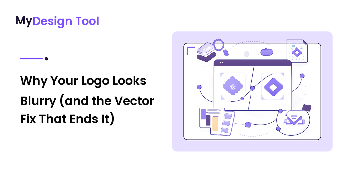
A raster image is a grid of colored squares — pixels. A 500-pixel-wide PNG contains exactly 500 pixels of horizontal detail, no more. Display it small and it looks sharp. Stretch it to 1500 pixels wide and the software has to fill the gaps, smearing each original pixel across three. The edges turn soft, color blocks appear, and the crisp logo becomes mush. The detail was never there; enlargement just exposes that.
A vector image stores no pixels at all. It records instructions: a circle here, this curve there, filled with this color. When you resize it, the software recalculates the shapes, so the result is always pixel-perfect — there's no fixed resolution to outrun. The same vector logo is razor-sharp on a 16-pixel browser tab and a 16-foot trade-show wall. The blur isn't bad design or a bad screen; it's a raster file being asked to do a vector's job.
How to tell which file you actually have
You can usually diagnose the problem in seconds, without any special software.
- Check the file extension. A logo saved as
.jpg,.jpeg, or.pngis raster. One saved as.svg,.ai,.eps, or.pdfis (almost always) vector. That's your fastest clue. - Zoom in hard. Open the file and zoom to 400–800%. If the edges break into a staircase of squares or go fuzzy, it's raster. If they stay clean no matter how far you zoom, it's vector.
- Look at the JPG tell. A logo on a colored or grainy background, especially a JPG, is raster — and JPGs add a faint smudge around sharp edges that no logo should have.
One catch: a vector logo can be exported to raster. Someone may have sent you a logo.png made from a perfect vector master. That PNG is still raster and still blurs when enlarged — but a sharp original exists somewhere, and that's the file you actually want.
The fix: get and use the vector master
The cure is to stop scaling raster copies and start from the vector source.
- Find the vector master. Ask whoever created the logo for the source file — an
.ai,.eps,.svg, or vector.pdf. This is the original, fully editable artwork, and a professional logo project should always deliver it. If you have it, the blur problem is over. - No vector? Request or recreate one. If only a JPG or small PNG exists, the logo was likely never made as vector, or the source was lost. You can't truly "convert" a blurry raster back to a clean vector by clicking a button — automatic tracing only approximates the shapes and rarely matches the original on type and fine curves. The reliable route is to have a designer redraw it as vector, which becomes your permanent master.
- Export the right raster size from the vector. Screens still need raster files, so export a fresh one at the exact size you need rather than scaling up an existing PNG. Need a 1200-pixel header logo? Export 1200 from the vector — don't stretch a 300-pixel PNG to fit.
Which file to use where
Match the file to the surface and the blur disappears:
- Print, signage, large format, anything that might scale → use the vector (PDF, AI, or EPS). Printers ask for vector precisely because it stays sharp at any physical size.
- Websites and apps → use SVG where supported; browsers render it natively, so a logo stays crisp on every screen and pixel density without shipping multiple files.
- When you must use raster on the web (an email, a platform that won't accept SVG) → export a PNG from the vector at the displayed size, ideally 2x for high-density screens, with a transparent background.
- Avoid JPG for logos entirely. JPG can't hold transparency and adds compression fuzz around the crisp edges a logo depends on. It's built for photographs, not flat-color marks.
The same logic protects any flat-color art with hard edges — icons, line illustrations, wordmarks. Choosing software that exports clean vector and raster is part of the job; if you're still settling on tools, the right design tool depends on the task you do most, and reliable export of both formats belongs on the shortlist.
Mistakes that keep logos blurry
Even with the right files, a few habits reintroduce the fuzz:
- Scaling up a small raster. The number-one cause. You can shrink a raster safely, but enlarging past its native pixels always softens it. Start from the vector instead.
- Re-saving a JPG over and over. Each save recompresses already-damaged pixels, so edges get progressively muddier. Export from a clean master, never from a previous export.
- Screenshotting the logo. Grabbing a logo off a website captures it at low screen resolution and bakes in the page background, so it never enlarges cleanly. Get the real file instead.
- Treating PNG as "the high-quality one." PNG is sharp at its exported size, but it's still raster — it blurs when scaled up just like JPG. Only vector escapes the resolution ceiling.
FAQ
Why does my logo look blurry when I make it bigger?
Because it's a raster file (JPG or PNG) made of a fixed number of pixels. Enlarging it past that built-in resolution forces the software to invent pixels, which softens and blocks the edges. A vector version of the same logo would stay perfectly sharp at any size because it's drawn from math-defined shapes rather than a fixed pixel grid.
What's the difference between a raster and a vector logo?
A raster logo (JPG, PNG) is a grid of pixels with a fixed resolution, so it blurs when enlarged. A vector logo (SVG, AI, EPS, vector PDF) stores the artwork as shapes and curves that recalculate at any size, staying crisp from a tiny icon to a billboard. For a logo — used at wildly different sizes — vector is the format you want as the master.
Can I convert a blurry logo into a sharp vector file?
Not perfectly with a one-click tool. Automatic tracing approximates the shapes but usually misses fine curves and exact typefaces, especially on a low-resolution source. The dependable fix is to find the original vector file, or have a designer redraw the logo as vector — that redrawn file becomes your permanent, scale-anywhere master.
Which logo file should I use for my website?
Use SVG where it's supported — it's a vector format browsers render sharply on every screen and pixel density. When a platform won't accept SVG, export a PNG from your vector master at the size it displays (2x for high-density screens) with a transparent background. Avoid JPG for logos, since it can't hold transparency and blurs the crisp edges.
What logo files should I ask my designer for?
Always ask for the vector source — an AI, EPS, SVG, or vector PDF — because that's the editable, scale-anywhere master. Then ask for ready-to-use exports: a transparent PNG and an SVG for the web. With the vector master in hand, you can produce any size you'll ever need without the logo going blurry.
Next step
Open your logo file right now and check the extension. If it ends in .jpg or .png, that's why it blurs when you scale it — so track down the vector master (.svg, .ai, .eps, or vector .pdf) before you use the logo larger again. Save that vector as your single source of truth, export each size from it, and your logo will stay sharp on every screen, page, and print job. Get the full toolkit and more practical design how-tos at https://mydesign-tool.com.