You approved a design that glowed on screen — a punchy blue, a neon green, a rich deep black. The printed piece comes back muddy, washed out, or just off, and the client asks why it doesn't match the proof you sent. Nothing is broken. You almost certainly designed in RGB and printed in CMYK, and those two color systems simply cannot show the same colors.
The takeaway up front, and the whole of RGB vs CMYK in one line: screens build color with light (RGB) and print builds color with ink (CMYK), and CMYK can reproduce a smaller range of colors. The bright, saturated tones that look electric on a monitor often have no exact ink equivalent, so the press substitutes the closest it can mix — which reads as dull. The fix is to design in the right color mode from the start, preview colors in CMYK before you commit, and let the printer's profile, not the press, be where surprises get caught.
Why screen and print colors disagree
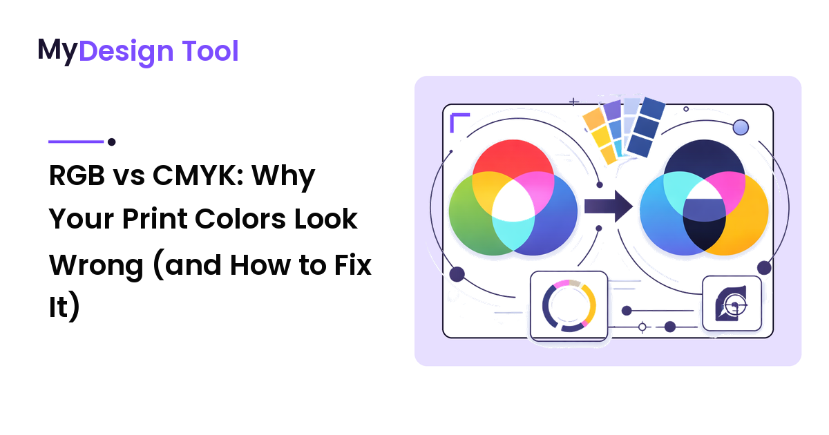
RGB stands for Red, Green, Blue — the colors of light a screen emits. It's additive: stack all three at full strength and you get white. Because it builds color from light, RGB can hit intensely bright, glowing tones, which is why a screen makes neon and saturated hues look so alive.
CMYK stands for Cyan, Magenta, Yellow, and Key (black) — the inks a printer lays on paper. Print is subtractive: every layer of ink absorbs some light and reflects the rest, so more ink means a darker, less luminous result. Paper can't emit light; it only reflects what hits it. That ceiling is the whole problem — the brightest colors a glowing screen produces sit outside the range any mix of those four inks can reach.
So when an RGB design goes to a CMYK press, every color outside the printable range gets remapped to the nearest reachable one: a vivid screen blue becomes a flatter blue, a glowing green calms down. The design isn't wrong — it's been translated into a language with fewer words, and the loudest ones have no direct match.
The colors most likely to shift
Not everything changes equally. Knowing which colors are fragile tells you where to look.
- Bright, saturated blues and purples are the classic casualties — they shift toward dull or slightly purple-gray because the inks can't reach that intensity.
- Vivid greens and oranges lose their glow and settle into muted versions.
- Neon and fluorescent anything has no standard CMYK equivalent; those effects need special spot inks, not the four-color process.
- Subtle near-white tints and pale gradients can band or disappear, because tiny ink percentages don't always hold on paper.
Neutral, mid-tone, and naturally muted colors usually survive with little change. It's the eye-catching, high-saturation colors — the ones you chose because they pop on screen — that are most at risk.
Set up your file in the right color mode
The cleanest fix is to never design in the wrong space. Decide the output first, then pick the mode.
- Choose the color mode when you create the document, not after. Most design tools ask whether a new file is for screen (RGB) or print (CMYK). If the piece is going to a printer — a flyer, business card, packaging, a banner — start it in CMYK color mode so you preview reachable colors the whole time.
- In CMYK you simply never see colors the press can't print. Your screen approximates the ink result, so the dull-blue surprise happens at your desk, where you can fix it, instead of at the print shop.
- If a file is already built in RGB, convert deliberately, then review. Switch the document to CMYK and look — especially at the saturated areas — because conversion is exactly when colors shift. Adjust the ones that moved too far rather than shipping whatever the automatic remap produced.
- Keep screen work in RGB. If the same artwork is also going on a website or social post, keep an RGB version for those. RGB is correct for screens; CMYK is correct for ink — use each where it belongs.
The common mistake is designing the whole project in RGB because it looks better, then converting at the last minute and being shocked. Converting early isn't a downgrade — it's choosing to see the honest result while you can still fix it.
Use color profiles and a soft proof to catch problems early
"CMYK" isn't a single fixed thing: different presses, papers, and ink sets reproduce color differently, and a color profile (an ICC profile) describes how a specific output turns numbers into actual color. Two habits prevent most print disappointments:
- Ask your printer which profile they want, and design to it. A good print shop will tell you the exact CMYK profile and settings for their equipment and paper, so your on-screen preview reflects their press, not a generic guess.
- Soft-proof before you send. A soft proof is a screen preview that simulates the printed result with a chosen profile — the closest you get without spending money. If a color goes dull, fix it now.
For high-stakes work a physical proof from the actual printer is still the gold standard, since no screen perfectly shows reflected ink on paper. But a soft proof catches the obvious, expensive surprises long before a hard proof would.
This output-mismatch logic shows up across design: the same wrong-asset problem happens with resolution and file type, which is why a logo can look sharp on screen and blurry in print — different output, different requirements, same lesson about matching the file to its destination.
FAQ
Why do my print colors look different and duller than on screen?
Because screens make color with light and print makes color with ink, and ink covers a smaller range. The bright, saturated tones a glowing screen produces often have no exact ink match, so the press substitutes the closest mixable color — which reads as flatter. Designing and proofing in CMYK lets you see and adjust those colors first.
Should I design in RGB or CMYK?
Design in the mode that matches the output. If the piece is printed, work in CMYK so you only ever see colors the press can reproduce. If it's for screens — a website, app, or social post — work in RGB, which is correct for emitted light. Forcing one mode to serve both destinations is what causes mismatches.
Do I have to convert RGB to CMYK myself, or will the printer do it?
You can let a printer convert, but then you don't control how saturated colors get remapped and won't see the result until proofs arrive. Converting deliberately yourself — then reviewing the colors that shifted — keeps the decision in your hands. Ask your printer which CMYK profile to use so your conversion matches their press.
What is a color profile and why does it matter?
A color profile (ICC profile) describes how a specific output — a particular press, ink, and paper — turns color values into printed color. Because coated and uncoated papers and different presses reproduce color differently, using the right profile makes your on-screen preview reflect your real printer instead of a generic average.
How do I get a deep, solid black in print?
Plain 100% black ink can look thin or gray over large areas, so designers use a "rich black" — black plus some cyan, magenta, and yellow. Don't overdo it, though, since too much total ink causes drying and registration issues. Your printer can tell you the rich-black mix and ink limit their process handles cleanly.
Next step
Before your next print job, do the one thing that prevents almost all of this: set the document to CMYK with the profile your printer asks for, look hard at the saturated colors, and soft-proof the file on screen. If a blue or green goes dull, fix it now while it costs nothing — the goal isn't to make screen and print identical, just to make sure the press is never the first place you see how your colors print. Plan your color and print setup with the right tools at mydesign-tool.com.