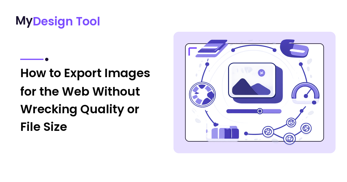
Most designers lose more image quality at the export step than during the entire edit. Not because the Save dialog is hard, but because it gets clicked on autopilot: same format, same quality slider, same dimensions, every time. The result is a portfolio of images that are either too heavy to load fast or too soft to look professional — and the maddening part is that both problems are invisible inside your editor. They only show up on the live page.
The fix is to treat export as a decision, not a reflex. This guide gives you a repeatable way to choose the right format, the right dimensions, and the right compression for each image, plus the specific traps that quietly ruin otherwise-perfect work.
The key takeaway up front: match the format to the content of the image (flat color and edges vs. photographic gradients), export at the pixel dimensions the layout actually displays times your target screen density, and push compression until you can just start to see damage — then back off one notch. Do those three things on purpose and your images get sharp and light at the same time.
Why export is where quality silently dies
Inside your design tool, every image is effectively lossless and full-resolution. The screen shows you the source, not what the visitor will receive. Export is the moment that source gets converted, resized, and squeezed into a file a browser downloads — and every one of those steps can degrade the image in a way you won't notice until it's published.
Three independent decisions interact at export:
- Format — how the pixels are encoded (this decides what kind of damage compression does).
- Dimensions — how many pixels you ship (this decides sharpness on real screens).
- Compression level — how hard you squeeze (this decides file size vs. visible artifacts).
Get one wrong and the other two can't save you. A perfectly compressed JPEG of a logo still looks dirty; a pristine PNG of a photo is needlessly huge. You have to reason about all three together.
Step 1: Choose format by what the image contains
The most common export mistake is choosing format by habit instead of by content. The right question is never "PNG or JPG?" — it's "does this image have hard edges and flat color, or soft photographic gradients?"
- Flat color, sharp edges, text, line art, logos, screenshots, icons → use a format built for that: PNG (or SVG if it's actually vector — see below). Lossy photo compression smears the crisp edges these images depend on.
- Photographs, gradients, anything with continuous tone → use a lossy format: JPEG, or better, WebP/AVIF. These formats are designed to throw away detail the eye won't miss in complex imagery, and they do it brilliantly. A PNG of a photo can be 5–10x larger for zero visible benefit.
- Needs transparency → PNG has always done this; WebP and AVIF do it and compress better. Plain JPEG cannot hold transparency at all.
- Truly vector content (logos, icons, simple illustrations made of paths) → ship SVG. It's tiny, infinitely sharp at any size, and never needs a density decision. If your logo lives as vector, exporting it to PNG is throwing away its single best property.
The modern default most people miss
If your audience uses current browsers, WebP and AVIF beat both JPEG and PNG at their own jobs — smaller files at equal quality for photos and sharper flat-color images with transparency. They are not exotic anymore. The reason designers still reach for JPEG/PNG is pure habit. Treat WebP/AVIF as your default for raster, and fall back to JPEG/PNG only when you specifically need maximum compatibility with very old clients.
Step 2: Export at the right dimensions (the part everyone fumbles)
Here is the trick that separates crisp work from soft work: export dimensions are a function of the display size and the screen's pixel density — not the size of your source.
A modern "Retina"/high-DPI screen packs roughly twice as many physical pixels into the same space. So an image that displays in a 600-pixel-wide slot must contain about 1200 pixels of real detail to look sharp on those screens. Ship only 600 and it looks soft; ship your full 4000-pixel original and you've wasted 90% of the bytes for detail no one can see.
The formula:
Export width = layout display width × target density (usually 2)
A concrete worked example
You're placing a hero image in a content column that's 800px wide on desktop. You want it crisp on high-DPI displays, so:
- Export width: 800 × 2 = 1600px.
- Format: it's a photo → WebP (fallback JPEG).
- Now compress (Step 3).
Compare the outcomes for that same hero:
| What you export | Approx. file size | Result |
|---|---|---|
| 4000px source PNG | ~8 MB | Slow page, zero visible benefit |
| 4000px JPEG @ 90 | ~2 MB | Still ~3x more pixels than any screen shows |
| 1600px JPEG @ 75 | ~180 KB | Sharp on high-DPI, fast |
| 1600px WebP @ 75 | ~110 KB | Same sharpness, ~40% lighter |
The 1600px WebP isn't a compromise — it's better on every axis the visitor experiences. The 8 MB PNG only looked "safest" because the bloat was invisible to you.
One caveat: never upscale at export. If your source is 1000px and the slot needs 1600px, you cannot conjure detail — you'll just ship a soft image with a large file size. Re-export from a larger original or accept the smaller display size.
Step 3: Compress to the edge, then back off one notch
Quality sliders are not labeled in any honest unit — "90" in one tool is not "90" in another. So stop trusting the number and trust your eyes, with a method:
- Open the export preview at 100% zoom (artifacts hide at fit-to-screen).
- Lower the quality until you just start to see damage — for photos that's mushy texture or blocky skies; for flat art it's fuzz around edges.
- Back off one step from there. That's your sweet spot: the smallest file that still looks clean.
Most photos look indistinguishable from the original somewhere in the 70–80 range, not 90–100. People who export everything at maximum quality are shipping double the bytes for detail the eye discards anyway.
The traps that ruin good exports
These are the specific, non-obvious failures that cause "I don't understand why it looks bad" — and why they happen:
- JPEG banding in skies and gradients. Smooth color transitions break into visible stripes because lossy compression handles gentle gradients poorly. Why: JPEG compresses in blocks and quantizes subtle tonal steps. Fix: use WebP/AVIF (far better at gradients), or add a tiny amount of noise/dither to the gradient before export to mask the banding.
- The dark halo on transparent PNGs. Anti-aliased edges that were composited against a white background show a gray fringe when placed on a dark page. Why: the semi-transparent edge pixels were blended with the old background color and baked in. Fix: export transparency from a source that was never flattened onto a colored background, and verify the asset on the actual page color.
- Re-saving a JPEG repeatedly (generation loss). Each save of a lossy file recompresses the already-damaged pixels, and the damage accumulates. Why: lossy compression isn't reversible. Fix: keep a lossless master (your editable source or a PNG/TIFF) and always export the final lossy version from the master, never from a previous export.
- Wrong color profile / oversaturated or washed-out web images. An image that looks right in your editor looks dull or garish in the browser. Why: it was exported in a wide-gamut profile the browser ignores. Fix: export web images in sRGB; it's the one profile every browser handles consistently.
- Stripping vs. keeping metadata. Camera images carry EXIF, GPS, and color data that can balloon file size and leak location. Fix: strip metadata on export for the web — but keep the color profile.
A repeatable export checklist
Run this every time and export stops being a guessing game:
- Vector or raster? Vector → SVG, done.
- Flat-color/edges or photographic? Picks your raster format family.
- Compatibility need? Modern audience → WebP/AVIF; otherwise PNG (flat) or JPEG (photo).
- Display width × 2 → export dimensions. Never upscale.
- Convert to sRGB, strip metadata, keep the profile.
- Compress at 100% zoom to the edge of visible damage, then back off one notch.
- Check the file on the real page at the real background color.
Knowing which tool exports each format cleanly is its own decision — if you're still settling on software, the right design tool depends on the task you do most, and export control belongs on that shortlist.
FAQ
Should I use PNG or JPG for web images?
Decide by content, not habit. Use PNG for flat color, text, logos, screenshots, and anything needing transparency. Use JPEG for photographs and continuous-tone images. Better still, use WebP or AVIF, which beat both for modern browsers — smaller photos and sharper flat art with transparency.
What's the best image size to export for a website?
Export at the pixel width the layout actually displays, multiplied by your target screen density — usually 2x for high-DPI displays. An image shown in an 800px slot should export at roughly 1600px. Shipping your full-resolution source wastes bandwidth on detail no screen can show, and exporting smaller than the display size looks soft.
Why does my image look worse on the website than in my editor?
Almost always one of three things: it was downscaled or compressed too hard at export, exported in a wide-gamut color profile instead of sRGB, or repeatedly re-saved as a lossy JPEG. Check at 100% zoom, export in sRGB, and always export the final lossy file from a lossless master.
How much can I compress an image before it looks bad?
More than most people think. Many photos are visually identical to the original around quality 70–80, not 90–100. The reliable method is to lower quality at 100% zoom until you just see damage, then back off one step — that's the smallest file that still looks clean.
Are WebP and AVIF safe to use yet?
Yes, for the overwhelming majority of current browsers. They outperform JPEG and PNG at both photographic and flat-color images and support transparency. Keep a JPEG or PNG fallback only if you must support very old clients; otherwise treat WebP/AVIF as your default raster formats.
Next step
Pick the next image you're about to publish and run the seven-step checklist on it instead of clicking Save out of habit. Decide its format from what it contains, set its dimensions from the layout times two, convert to sRGB, and compress to the edge of visible damage. Do that consistently and your images get sharp and light at the same time — the exact thing autopilot exporting never delivers. Get the full toolkit and more practical design how-tos at https://mydesign-tool.com.