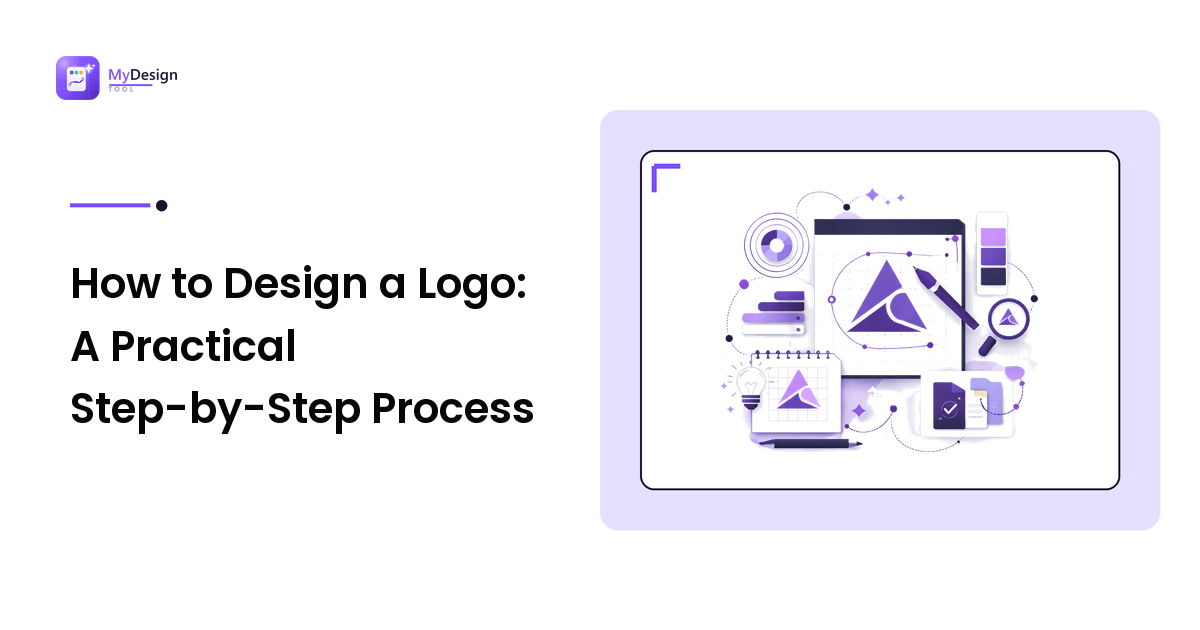
To design a logo, start by defining what the brand stands for and where the mark will be used. Sketch many rough directions before choosing one, build the chosen idea as vector artwork, then test it small, in one colour, and on both light and dark backgrounds. Finish by exporting a complete file set.
That order matters more than drawing skill. Most weak logos fail because the decisions were made backwards — someone opened a design app, picked a font they liked, and only later asked what the brand was supposed to say. Below is the process in the sequence that actually works, plus the tools, tests, and files that turn a nice shape into a usable identity.
What do you need to decide before you design anything?
Before a single shape exists, write down four things. Each one narrows your options in a useful way.
- What the brand does and who it's for. A logo for a children's dental clinic and one for a security auditing firm should not be interchangeable. Name the audience in one sentence.
- Three adjectives for the personality. Warm, technical, premium, playful, dependable — pick three and commit. These become your test for every draft.
- Where it will appear. A logo used mainly as an app icon has different demands from one destined for shop signage and printed packaging.
- What already exists in the category. Look at competitors — not to copy, but to notice what everyone is doing. If every rival uses a blue shield, a blue shield makes you invisible.
This brief should fit on one page and give you a reason to reject ideas later.
What are the steps in the logo design process?
Work through these in order. Skipping ahead is where most DIY logos go wrong.
- Write the brief. The four decisions above. Ten minutes now saves days of aimless redrawing.
- Sketch broadly and cheaply. Pen and paper, or rough shapes on screen — twenty to forty thumbnails, small and fast. The goal is quantity, not beauty. Your first five ideas are usually the most obvious ones, which is exactly why you need to get past them.
- Choose two or three directions. Look for concepts that are distinct from each other, not three versions of the same idea. Judge them against the brief, not against how much effort each took.
- Build in vector. Rebuild the chosen sketches as vector artwork so the mark stays sharp at any size. Keep shapes simple, control your curves, and align elements deliberately.
- Set the wordmark. Most logos are mostly type. Choose a typeface that matches the personality, then adjust letter spacing so the name reads evenly. Custom-tightened spacing is often what separates a professional wordmark from a default one.
- Test it hard. Shrink it, strip the colour, flip the background, place it in context. Details in the next section.
- Refine, then decide colour. Get the shape right in black and white first, then add colour as reinforcement rather than rescue.
- Export a proper file set. Vector master plus the raster sizes you'll actually use, in light and dark versions.
Which tools should you use to design a logo?
You need a tool that produces true vector output. Photo editors and raster apps will let you draw something that looks fine on screen and then fall apart on a banner — see why logos look blurry and the vector fix for the mechanics of why that happens.
| Tool | Best for | Trade-off |
|---|---|---|
| Adobe Illustrator | Full-control vector drawing and print-ready output | Subscription cost and the steepest learning curve |
| Affinity Designer | A capable vector alternative bought outright | Smaller ecosystem of tutorials and plugins |
| Inkscape | Free, open-source vector work and SVG editing | Interface feels less polished; slower for some workflows |
| Figma | Fast shape work, sharing, and screen-first marks | Built for interface design, so print prep is limited |
| Penpot | Free, open-source, browser-based vector and UI work | Younger tool; feature set still expanding |
| Canva | Quick template-based marks for non-designers | Template-driven results risk looking generic |
Choose on three criteria: does it export real vector files, can you learn it in the time you have, and does it fit your budget. For a wider view of the categories and where each app fits, our graphic design tools guide covers the landscape.
AI logo generators belong on the same list with the same honesty: they are excellent at producing directions quickly when you're staring at a blank page, and they let you see a name set in dozens of ways in minutes. What they don't do is make the judgement calls — which direction fits the brief, where the spacing is off, whether the mark still reads at 16 pixels. Treat generated output as raw material to refine, not as a finished identity.
How do you know if a logo actually works?
Run every candidate through these five tests. A mark that survives all five is usually a keeper.
- The small test. Shrink it to about 16–32 pixels wide, the size of a browser tab or app icon. If the details mush together, simplify until they don't.
- The one-colour test. Convert it to solid black, then solid white on a dark background. If the mark depends on a gradient or a colour split to be legible, it will break in embroidery, engraving, faxed forms, and single-colour print.
- The background test. Place it on white, on black, on a photo, and on your brand colour. You'll usually discover you need a light version and a dark version — that's normal, not a failure.
- The distance test. Blur it or step back from the screen. What remains should still be recognisable as your shape.
- The memory test. Show it to someone for five seconds, then ask them to describe or sketch it. If they can't, it's probably too complex.
Colour comes after this, and one technical point matters: screens use RGB and most commercial printing uses CMYK, so a colour that glows on a monitor can print duller. Define your brand colour with print in mind if the logo will ever appear on physical material.
What files do you need when the logo is finished?
Deliver — or keep — a set, not a single file. The minimum:
- Vector master (SVG, and AI/EPS or vector PDF if print vendors are involved). This is the source everything else is generated from.
- PNG exports with transparent backgrounds at the sizes you actually use, exported fresh from the vector rather than scaled up from another PNG.
- A light version and a dark version, so the mark stays legible on any background.
- A simplified or icon-only variant for avatars, favicons, and tight spaces, if your primary mark is too detailed at that size.
- Clear-space and minimum-size rules, written down so nobody crowds or shrinks the logo past the point where it works.
Those last rules are the start of a brand system. Once you've locked the mark, record the fonts, colours, and usage rules alongside it — a brand style guide is where that belongs, and it's what keeps the logo consistent once other people start using it.
FAQ
How long does it take to design a logo? It varies widely. A simple wordmark for a personal project can come together in a day; a considered mark with proper exploration, testing, and file delivery usually takes longer because the sketching and testing stages are where the quality is won.
Can I design a logo myself without design experience? Yes, within limits. Following the process above will get a non-designer to a workable mark. What experience mainly buys is faster judgement about which direction to pursue and sharper craft in the drawing and spacing.
Should a logo have text, an icon, or both? Both is the most flexible starting point: a combination mark gives you the full lockup for wide spaces and an icon for tight ones. If the name is short and distinctive, a wordmark alone can be plenty. An icon alone only works once people already recognise the brand.
Why does my logo look fine on screen but bad in print? Two usual causes: you exported a raster file instead of using vector artwork, or the colours were defined for screen (RGB) and shifted when converted for print (CMYK). Supply printers with the vector master and check colours in the print colour space before approving.
Are AI logo generators good enough on their own? They're genuinely useful for exploring directions fast and escaping a blank canvas, and for many early-stage projects the output is a reasonable starting point. They still need a human to choose, refine, test at small sizes, and produce the final file set — so treat them as a head start on step two, not a replacement for the whole process.
Start with directions, then refine
The best logo process is unglamorous: decide what the brand means, generate far more options than you need, build the winner properly in vector, and test it until it survives the worst conditions it will face. If you want to skip the blank-page stage, MyDesign Tool is built to turn a short brief into design directions you can explore quickly — then bring the one that fits back through the testing and file steps above.